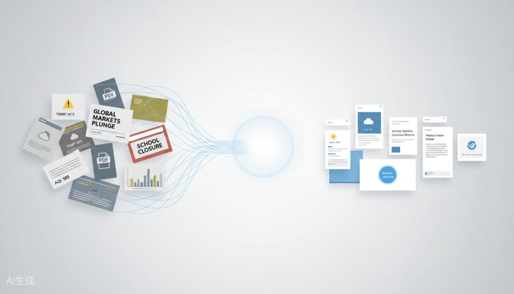
A product case study on scraping sources, designing for content consumption, and building a platform that turns official data into readable intelligence.
The News Aggregation Problem Nobody Talks About
Every morning in Hong Kong, I’d check for weather warnings, see if there are any school announcements. Look for air quality readings. Then flip between apps for local news.
This isn’t unique to Hong Kong. Official data could be scattered across government portals, each with its own interface, its own update schedule, its own idea of what “user-friendly” means. But here’s the bigger problem: even the so-called solutions make it worse. News aggregators show you a headline and a two-line teaser, then force a click-through to a media site loaded with ads, paywalls, or a PDF that renders like it was designed in 2003. You get cliffhangers, not content. A headline with a “Read More” link that dumps you into a page written for scientists.
We didn’t set out to build a weather app. We set out to solve information fragmentation for Hong Kong residents. Weather just happened to be the most urgent, high-frequency channel — the one everyone checks, the one that affects your day in immediate, concrete ways. If I could build a platform that pulled from legitimate official sources, compiled the full content, and presented it as readable, scannable intelligence, I’d have something genuinely useful. Not another headline vending machine. A source of truth.
That became Dayline Observer.
Finding the Gap Between Official Data and User Experience
The name came first. I wanted something that felt like a daily ritual — “Dayline” — combined with something observational and credible — “Observer.” I was thinking about a brand that could eventually scale beyond one city or one content type, because if the aggregation engine worked for Hong Kong weather, it could work for other verticals too.
Then I studied the competition. Government portals that frame themselves as service delivery platforms. In my experience, designing for consumption could be difficult. Especially if a product team prioritizes completing a checklist of things rather than designing for actual users. Imagine pinching to zoom on a PDF at 8am while you’re holding a coffee, it is not a good experience. It has been difficult to find ones that could render full content in a readable format. They link to documents. They don’t deliver intelligence.
Here’s what I noticed: weather services have a natural UX advantage. A temperature number and a cloud icon immediately communicates value. You don’t need to “read” weather. You glance at it. News aggregators, on the other hand, drown users in headlines, thumbnails, and clickbait. They optimize for engagement — clicks, time-on-site, ad impressions — not for getting you informed and getting you out. I wanted Dayline to feel as immediately understandable as a weather app, but deliver the purpose of a news platform.
That led to a key product decision early on: instead of scraping headlines and linking out like every other aggregator, I’d scrape full content from legitimate sources, summarize and render it. No click-through. No PDFs. No TMI. The article itself would be the destination, not the bait.
From day one, I was thinking about data architecture. Where does content come from? How do I validate it? How do I keep it fresh? This was the research hat — understanding the pipelines before designing the interface.
Designing Channels, Not Just Tabs
I started with four content channels: News, Weather, EDB (Education Bureau announcements), and Air Quality. I called them channels, not features. Not tabs. Channels. Because framing matters — these are content categories within a single aggregation engine, not accessories to a weather app. Each channel pulls from a different official source, with different update frequencies, different content densities, and different user needs.
The design process went down two paths. Path one: I generated desktop and mobile prototypes from scratch. Full creative control, but time-intensive. Path two: I explored open-source design systems. Fast, but generic. In the end, I took what worked from the open-source systems and made it my own. Pragmatic PM judgment — I didn’t let perfect be the enemy of shipped. The result was clean, minimal, and scannable. No decorative elements.
The information architecture was the real challenge. How do you design a reading experience that handles a two-line rain warning, an EDB announcement about school closures, and a radar image — all in the same interface? The density varies wildly. The answer was flexibility: a layout that adapts to content length without feeling inconsistent. Short updates get breathing room. Longer content stays readable. Images scale naturally.
EDB Alerts became a new content channel because education announcements are just as fragmented and urgent as weather warnings for parents and students. School suspensions don’t belong buried on a government website and local TV news should not be the only source of information. They belong where people already look for time-sensitive information.
The Air Quality channel was where user research changed the design. At first, I planned to list every station’s reading – 16 stations across Hong Kong, each with its own AQI value. Seemed comprehensive. But when I showed it to users, nobody cared about the numbers. They didn’t want to cross-reference station names against a government scale. They wanted one thing: how’s the air where I am? So we pivoted. Instead of raw readings, we segmented the data into two glanceable states – Air Quality Warning (values above 50) and Air Quality Alert (values above 100) – each with a clear label. Stations that hit the threshold are called out first. Everything else is listed below as reference. Same data, different presentation. From spreadsheet to summary.
After launch, we added dark mode and light mode as one of the first follow-up features. The app gets used at 6am and midnight. Reading comfort is part of the product experience — not a checklist item. Then followed Chinese language support, we used AI to translate the content from English.
For the brand, I designed both a mark-only logo and a wordmark version. I wanted a visual identity that could eventually cover more channels without feeling tied to weather. The mark needed to work as an app icon, a favicon, and a social avatar. The wordmark needed to feel credible enough for a news platform but approachable enough for a daily-use app.
This was the UX/UI hat — interpreting competitor patterns and adapting them to my user’s mental model. Not copying. Translating.
Summarized Content and Anti-Clickbait
“No cliffhangers” became a product principle. Walk through the news list in Dayline and you’ll see what I mean — the summarized article renders. The gist of the news, formatted for reading on a phone, without a single “Read More” button. When the article is the destination rather than the bait, everything changes. The design prioritizes readability over click-through rates. The user trusts that what they see is what they get.
Notifications were designed as a briefing service, not an alert system. These aren’t “weather alerts” blasting your lock screen with panic-inducing banners. They’re curated news briefings pushed when official sources update — a trusted editor tapping you on the shoulder, not an ad network demanding your attention. This one informs. The other performs.
Content sourcing and integrity is where trust lives. Dayline scrapes from reliable news sources and the Hong Kong Observatory — official sources with editorial standards, not random blogs or user-generated content. In an era of misinformation, trust is the product. At Base87 Technologies, we made the sourcing transparent because users should know where their information comes from.
I also wrote all the taxonomy — the channel labels, the navigation categories, the empty states, the error messages. A news platform lives or dies on how it talks to users. “No updates yet” hits different from “Failed to load content.” One sounds like a patient editor. The other sounds like a broken machine. I chose the editor.
Teaching AI to Read Radar
The “Will It Rain” feature started with a simple frustration. The Hong Kong Observatory publishes detailed weather bulletins — professional meteorological writing that’s technically excellent and practically useless for most people. I tried summarizing HKO’s text into plain English using AI. It worked, but it was still secondhand interpretation. I was translating what someone else wrote, not answering the question people actually had.
So we pivoted. Instead of summarizing what HKO wrote, our team at Base87 Technologies used AI to interpret what HKO saw — the raw radar images. Our aim was to let AI read precipitation patterns and answer one direct question: Will it rain?
It worked. The shift from text summarization to image interpretation changed the product from a news compiler into a weather intelligence engine. The aggregation layer became an interpretation layer — and that’s a fundamentally different kind of product.
The platform implication is what excites me. If you can teach AI to read radar, you can teach it to read any primary source data — satellite imagery, traffic cameras, supply chain dashboards, medical imaging. The same pipeline that interprets weather patterns can interpret patterns in any visual data source.
This wasn’t in the original scope. Based on some user interviews, I found a user need — people aren’t really into reading through the color scales on a radar image, they want to know if they need an umbrella — iterated on the solution, and landed on a technical approach that elevated the entire platform. That’s the PM hat. Scope what matters. Ship what works. Follow the user need even when it takes you somewhere unexpected.
Adding Channels and Building Trust
I launched with four channels to prove the aggregation engine worked. Once it did, I added more content verticals based on real-world demand — not a roadmap document, but actual user behavior and the gaps I observed.
“Will It Rain” shipped as a summarization and interpretation feature — demonstrating that the platform doesn’t just aggregate raw data, it interprets it. The product moved from distribution to intelligence. That’s the difference between a feed and a platform.
The FAQ section is the most recent addition. We built it at Base87 Technologies because users deserve to know where information comes from and how often it updates. But we applied a strict constraint: answer trust questions without turning the app into a documentation wiki. Keep it scannable. Keep it human. The goal is confidence, not comprehensiveness.
This is platform roadmap thinking. Prove the engine with a focused set of channels. Then expand vertically into new content categories and horizontally into trust infrastructure — based on behavior, not assumptions.
From News Aggregator to Replicable Platform
Dayline.observer isn’t a weather app with news. It’s a content aggregation and interpretation engine with weather as its first vertical. The scraping pipeline, the content rendering layer, the notification system, the AI interpretation layer — all of it is replicable for other industries. The architecture doesn’t care whether it’s pulling weather bulletins or logistics data, or radar images. The pattern is the same:
Fragmented official data → Structured aggregation → Readable intelligence → Optional AI interpretation.
Being a hybrid product person — owning research, product decisions, UX, and copy — meant I could make platform decisions faster. The blurring lines I wrote about in my previous article aren’t a theoretical concept here. They’re a competitive advantage. When you can hold the whole product in your head, you ship faster and you ship more coherently.
Scope discipline was critical. I proved the engine with four channels. The roadmap from there is infinite — news, weather, school, air quality — but proving the core first is what separates a project from a platform. A project builds features until it gets bored. A platform proves the engine, then scales the verticals.
There’s also a difference between a portfolio mockup and a shipped URL. Dayline Observer is live. It has real data, real users, real edge cases. That changes how you design for content and trust. A mockup doesn’t fail at 6am when a server times out. A live product does — and you learn to design for that reality.
Every industry has fragmented official data. Most companies solve it with a PDF link or a third-party widget. I built a platform that turns it into a product. If yours is one of them, let’s talk.
What I’m Still Fixing
Dayline Observer is live, but it’s not finished. A few things I’m actively working on:
Radar reading accuracy. The AI interpretation of radar images works, but it’s not perfect. Sometimes it reads precipitation patterns slightly off. I’m exploring get iterate from the current state.
FAQ page UI. It does the job, but it looks clunky. I need to rethink the information hierarchy before adding more content there.
Rethinking the channels. I am looking forward to finding out more on how people navigate the site. With this information, I might need to combine some contents from different tabs.
Explore Dayline at Dayline.Observer. If your company is sitting on fragmented data sources — weather, logistics, compliance, health — the Dayline model is replicable. Let’s talk about building your aggregation layer with Base87 Technologies. You can also find me on LinkedIn or visit my website at checkeredpotato.com.
